Lawson Antique
Primary Foundry · Jonathan Maghen
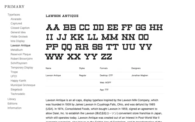
An all-caps display face drawn from the mid-century lettering of the Lawson Milk Company, evoking postwar American commercial culture.
About
Designed by Jonathan Maghen and inspired by the signage and branding of the Lawson Milk Company, founded in Ohio in 1939 and defunct by 1985. The typeface traces a particular strand of postwar American economic expansion and its effect on the visual environment, offering 96 glyphs covering basic Latin, lining figures, punctuation and symbols. Available in a single Regular weight, it suits display and editorial work where a restrained, historically grounded vernacular tone is wanted.
Classification
An all-caps display typeface with a single weight, drawing on mid-twentieth-century American commercial lettering; the antique label and its vernacular source material place it firmly in display territory.