Elena
Process Type Foundry · Nicole Dotin · 2011
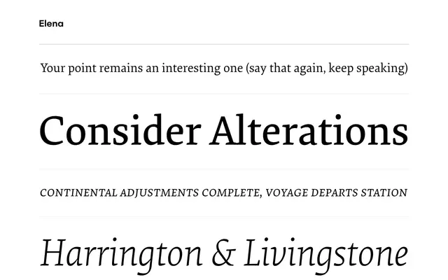
A low-contrast text serif by Nicole Dotin, designed for sustained reading in print and on screen without leaning on historical precedent.
About
Designed by Nicole Dotin and released in 2011 with an update in 2016, Elena offers four weights in eight styles for text and medium-sized display work. Its economic proportions and low contrast keep it comfortable across print and screen contexts, while a full OpenType feature set — small caps, old-style and tabular numerals, case-sensitive glyphs and stylistic alternates — gives it the depth expected of a serious text face. Typographica named it among their favourite typefaces of 2011.
Classification
A low-contrast modern serif with economic proportions and crisp detailing, designed explicitly for extended reading — placing it in the transitional serif tradition, updated for screen and print use.