Locator
Process Type Foundry · Eric Olson · 2003
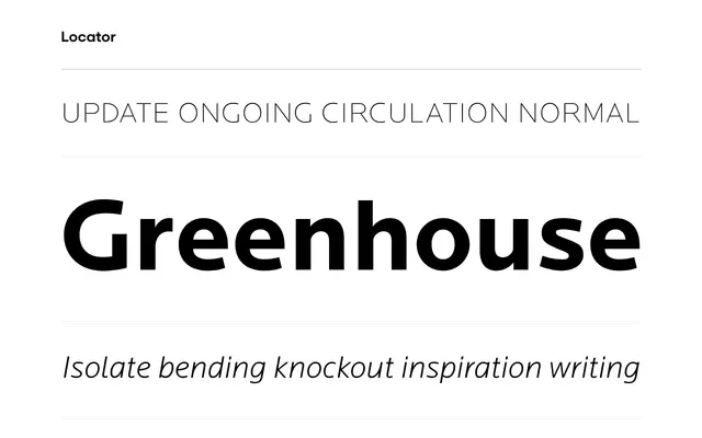
A six-weight grotesque sans by Eric Olson built around horizontal emphasis and restrained detail, with a caps-only companion for display work.
About
Designed by Eric Olson and originating from sketches for the Typeface: Twin Cities competition, Locator runs six weights with matching italics suited to both text and display setting. Particular care was given to the capitals, which carry enough presence for titling use without overstatement. A companion family, Locator Display, shares the same stroke weight and cap-height for direct pairing.
Classification
A text and display sans with horizontal emphasis and limited detail, consistent with the grotesque tradition; the restrained stroke contrast and refined capitals point away from humanist warmth.