Scandia Line
Process Type Foundry · Eric Olson · 2015
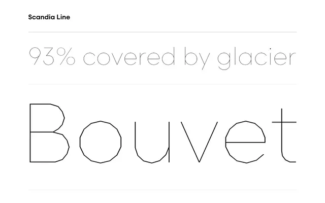
A four-weight geometric sans by Eric Olson built entirely from straight lines and angled segments, with a stencil variant and stylistic alternates for sharper corners.
About
Every curve in a conventional sans-serif has been replaced with straight lines and angled segments, producing letterforms that suggest familiar circular proportions without actually using them. Four weights from Light to Bold were drawn with care: the number of sides on constructed characters shifts between weights to control contrast and prevent monotony. A stencil variant extends the family, and stylistic alternates sharpen the corners on A, M, N, V, W and their lowercase counterparts.
Classification
A sans-serif built entirely from straight lines and angled segments rather than curves, giving it a skeletal geometric character while retaining conventional letterform proportions.