Sculpin
Process Type Foundry · Eric Olson · 2021
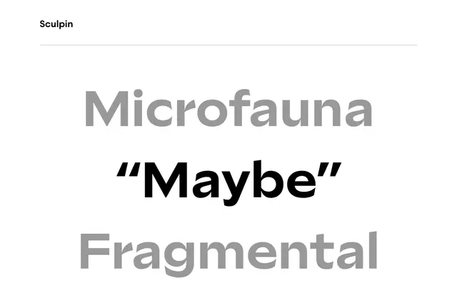
A wide-bodied, high-contrast sans by Eric Olson that borrows its finishing details from chisels, brushes and stone carving to create a family equally indebted to American sign painting and Swiss Modernism.
About
Eric Olson draws on the physical logic of square-edged tools to generate Sculpin's distinctive vocabulary: high-contrast joins, sharp cuts and reverse terminations that bind the letters into a coherent visual system. The family runs five weights from Light to Black with matching italics, and a weight-axis variable font is included free with any complete family licence. The wide proportions and layered references to sign painting, stone carving and mid-century Swiss design make it well-suited to editorial and display contexts that want formal rigour with material warmth.
Classification
Sculpin is a high-contrast sans with sharp cuts, reverse terminations and chisel-like stroke endings drawn from sign painting and stone carving traditions, placing it in a flared or serifless Roman subcategory rather than a conventional grotesque.