Hoss Round
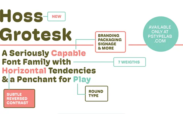
A grotesque with rounded terminals and horizontal stroke contrast, giving it a friendly warmth that sits between workhorse and characterful.
About
Hoss Round is built around a deliberate horizontal contrast — the opposite of the classical vertical emphasis found in most grotesques — combined with rounded terminals and stroke endings. This combination produces a typeface that feels approachable without sacrificing utility across seven weights from Light to Ultra, each with matching italics. Suited to brand identity and packaging where legibility and a degree of personality are both required.
Classification
A grotesque sans-serif with rounded terminals and horizontal stroke contrast, placing it firmly in the grotesque genre with a softer, more playful character than standard grotesques.