Hoss Sharp
sans-serifgrotesqueitalic
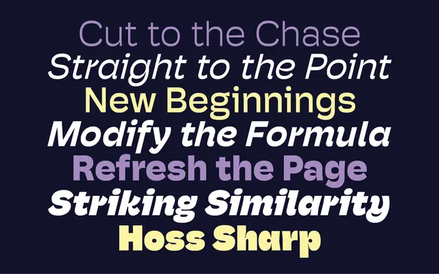
A crisp, sharp-edged grotesque with subtle horizontal contrast, offered as the angular companion to PS Type Lab's rounder Hoss styles.
About
Hoss Sharp sits within the broader Hoss family as its harder-edged counterpart, defined by a subtle horizontal stroke contrast that separates it from the round cuts. Seven weights run from Light to Ultra, each with a matching italic, giving the family a wide range for both text and display use. Alternate glyphs for characters such as 'a', 'g', 'k', 'l' and 'y' add flexibility for editorial and branding contexts.
Classification
Described as a modern grotesk with subtle horizontal contrast and a crisp, sharp character, distinguishing it from its rounder sibling styles within the Hoss family.
Weights
LightRegularMediumBoldBlackHeavyUltra
Languages
Latin
Tags
grotesquemodernhorizontal-contrasteditorialsharpversatile