Anamorphe
Pyte Foundry · Anselm Felter · 2026
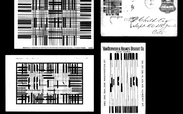
A variable display typeface by Anselm Felter that revives the 19th-century practice of perspectively distorted letterforms, enabling messages to be hidden in plain sight and revealed only at extreme viewing angles.
About
Drawing on historical examples of anamorphic writing collected by ephemera scholar Richard D. Sheaff, Anamorphe stretches horizontally from condensed sans to wide serif across a single variable axis, allowing overlapping words to be read from perpendicular directions. The design cites precedents spanning Erhard Schön's 16th-century woodcut riddles to Bavarian sign-painting manuals of 1903, blending angular and rounded details that reflect the inconsistencies of its source material. An optional ball terminals stylistic set adds a further layer of ornamental absurdity to an already wilfully difficult typeface.
Classification
Anamorphe is a display typeface built around the historical practice of perspective anamorphosis, with extreme horizontal width variation that intentionally distorts letterforms for obfuscatory effect. Its hybrid character, shifting from sans in condensed widths to serif as width increases, places it firmly in the display category with no conventional subcategory applicable.