Atica
R-Typography · Rui Abreu · 2022
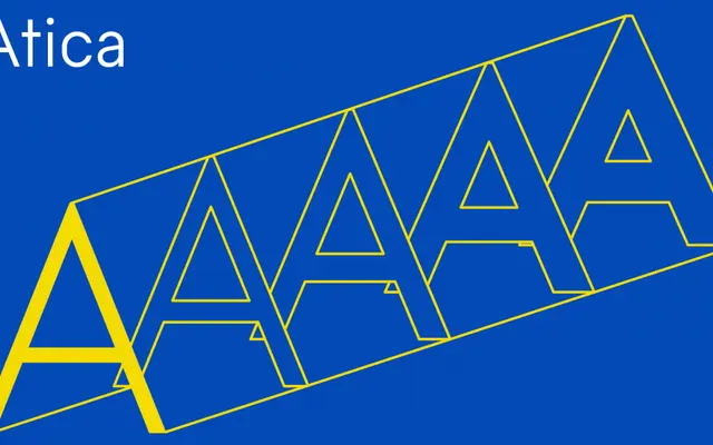
A geometric sans with a brutalist edge, built on Futura's proportions but distinguished by narrowed, double-circle O constructions that give it a muscular regularity.
About
Designed by Rui Abreu with ExtraLight and Italic masters developed by Francisco Torres, Atica takes the German geometric tradition of Futura as its starting point but departs from circular forms in favour of narrower Os constructed from two vertically offset circles. This produces more regularised stroke widths and a stockier, more forceful appearance than its classical precedents. Ten styles span five weights from ExtraLight to Bold, each with an italic, and a variable font is also available.
Classification
Described as German-inspired geometric, explicitly evoking Futura and Paul Renner's proportions, placing it firmly in the geometric sans-serif tradition, with a brutalist inflection from its non-circular, offset-circle O construction.