Azo Sans
R-Typography · Rui Abreu · 2021
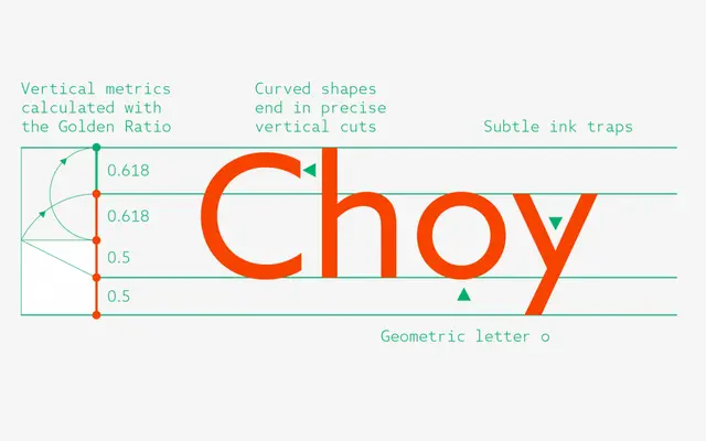
A geometric grotesque by Rui Abreu that tempers 1920s constructivist rigour with humanist softening to improve readability at text sizes.
About
Built on elementary geometric forms and drawing on constructivist typefaces of the 1920s, Azo Sans introduces humanistic nuances that ease the strictness of pure geometry, making it comfortable to read across longer passages. The family runs to 12 styles across six weights from Thin to Black, each with a matching italic. Its broad Latin language support extends to a wide range of lesser-resourced scripts and regional varieties.
Classification
Described explicitly as a geometric grotesque, constructed on elementary geometric forms with constructivist 1920s influences, while incorporating humanist qualities that soften its strict geometry.