Basilar
R-Typography · Rui Abreu · 2023
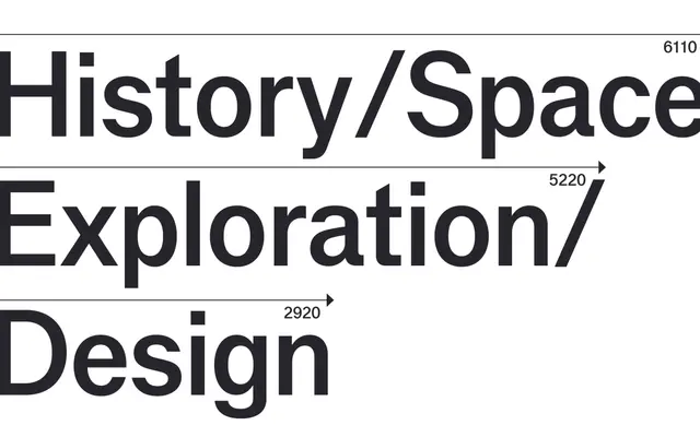
A rational grotesque by Rui Abreu rooted in the German typeface Venus, with systematised glyph widths that produce a compact, subtly mechanised rhythm.
About
Rui Abreu drew on Venus, the early 20th-century German grotesque that fed into Swiss Style typography, giving Basilar its constrained letter widths and slightly condensed lowercase. The metrics are rigorously systematised so glyphs share a reduced set of widths, lending the text a quietly mechanised cadence without losing the eccentric proportions — notably the generous bowl of the 'a' — that give it character. The family extends to Basilar Mono, where every character shares an identical width, taking the concept to its logical extreme.
Classification
Basilar draws directly from the early 20th-century German grotesque Venus, sharing its constrained letter widths and slightly condensed proportions; the systematised glyph widths and mechanised rhythm place it firmly in the rational grotesque tradition.