Chassi L
R-Typography · Rui Abreu · 2021
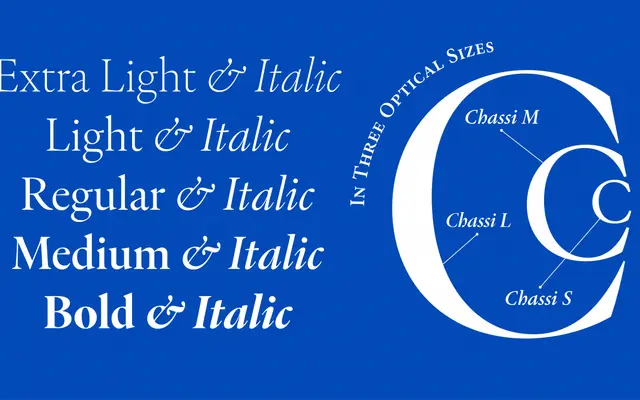
A Garamond revival designed as a genre study rather than a strict historical facsimile, with three optical variants tuned for different size ranges from body text to large display.
About
Designed by Rui Abreu, Chassi L is the display-optimised optical cut of the Chassi family, intended for use at 96 point and above, where its high contrast, tight spacing and sharp details read at their best. The family as a whole draws on Claude Garamond, Robert Granjon and Jean Jannon as collective reference points rather than pursuing fidelity to any single source. Ten styles across five weights from ExtraLight to Bold, each with a matching italic, cover an extensive range of Latin-script languages.
Classification
Chassi is a revival of the Garamond genre, drawing on the elegant roman types of Claude Garamond, Robert Granjon and Jean Jannon. Its high contrast and sharp details in the L optical size place it firmly in the old-style humanist serif tradition.