Flecha L
R-Typography · Rui Abreu · 2019
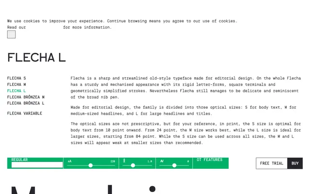
The large optical size of Rui Abreu's Flecha family, designed for headlines and titles from 84 point upward in editorial contexts.
About
Flecha L is the display-optimised cut of Rui Abreu's Flecha, an old-style serif built for editorial design with rigid letterforms, square terminals and geometrically simplified strokes that retain a faint trace of the broad-nib pen. The family spans three optical sizes — S for body text, M for mid-scale headlines, L for large display — with Flecha L offering 12 styles across six weights from ExtraLight to Black, each with a matching italic. Picked up by Afar, Billboard, Esquire and Max Magazine, it has established itself as a credible editorial serif in the years since its 2019 release.
Classification
Flecha is described as an old-style typeface with square terminals, geometrically simplified strokes and broad-nib pen references, placing it firmly in the old-style serif tradition with a mechanised, contemporary inflection.