Gineto
R-Typography · Rui Abreu · 2021
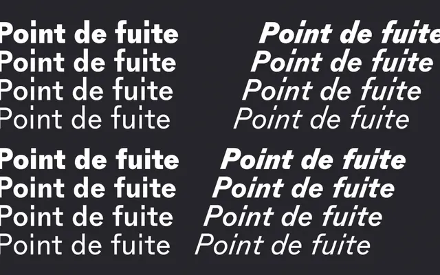
A contemporary grotesque by Rui Abreu drawn from the brevier cut of Gothic no. 4, designed for small sizes with open forms, generous spacing and long ascenders.
About
Rui Abreu derived Gineto from the brevier size of Gothic no. 4, an 1800s design from New York's Farmer, Little & Co., retaining its narrow proportions, generous letterspacing and elongated extenders. Open counters prevent the ambiguity common in closed grotesque letterforms, and input from Frutiger's OCR B adds legibility precision, while a nod to Akzidenz Grotesk keeps the European sans tradition audible. The family comes in two sub-families, Gineto and Gineto Fit, which share the same design but swap the default length of ascenders and descenders, with stylistic alternates providing the opposite set in each.
Classification
A contemporary grotesque with explicit lineage from 19th-century American Gothic no. 4 and influences from Akzidenz Grotesk, placing it firmly in the grotesque sans-serif tradition with humanist undertones from OCR B.