Gliko Modern L
R-Typography · Rui Abreu · 2018
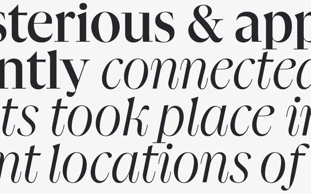
The large optical size of Rui Abreu's Gliko Modern, designed for headlines and display settings from 96 points upward.
About
Gliko Modern L is the large optical cut of Rui Abreu's editorial serif, optimised for display and title use from 96 points. The design tensions Dutch Old Style sturdiness against Didot-era rationalisation, combining high stroke contrast with a mixture of unbracketed and wedge-shaped serifs, a generous x-height and mixed stress axis. Ball terminals, common to both historical models, are deliberately absent. Ten styles run across five weights from Light to Black, each with a matching italic.
Classification
Gliko Modern sits between Dutch Old Style and Didot rationalism: high stroke contrast, unbracketed and wedge-shaped serifs mixed, large x-height and mixed stress place it firmly in transitional territory with Didone leanings.