Grifo L
R-Typography · Rui Abreu · 2016
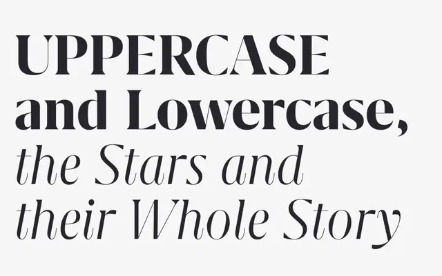
A high-contrast neoclassical serif by Rui Abreu, cut with sharp triangular terminals and talon-shaped curves, optimised for display and large-scale use.
About
Grifo L is the display optical size of Rui Abreu's Grifo family, which draws on neoclassical stroke contrast while adding bracketed serifs and emphatic sharp spikes throughout the letterforms. The design carries a deliberately rational quality: vertical strokes end in abrupt horizontal cuts and baseline serifs on several letters are removed to sharpen and tighten the overall texture. Ten styles run from Light to Black with matching italics, and the family has seen use in publications including Texas Monthly, Fast Company and M Le Magazine du Monde.
Classification
Grifo L exhibits extreme stroke contrast drawn from neoclassical models, with bracketed serifs and sharp triangular terminals that give it a precise, scalpel-cut rational character distinct from conventional Didone types.