Mild Grotesk L
R-Typography · Rui Abreu · 2026
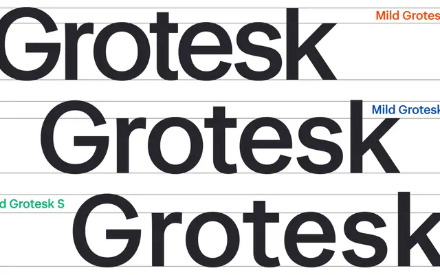
A humanist-inflected grotesque by Rui Abreu, available in three optical sizes with round forms and open, stroke-following terminals.
About
Designed by Rui Abreu, Mild Grotesk sits between the rational clarity of Neo-Grotesque and the warmth of humanist sans-serif design. Three static optical sizes, L, M and S, tune spacing and proportions for display impact or continuous reading respectively, while a variable font version synchronises the optical axis dynamically with body size. Terminals follow the natural direction of the stroke rather than meeting a horizontal cut, keeping apertures open throughout the five weights.
Classification
Described by the designer as bridging Neo-Grotesque rationality and humanistic warmth, with open terminals following natural stroke direction and humanistic proportions that depart from uniform Grotesk rhythm.