Picaresk
R-Typography · Rui Abreu · 2023
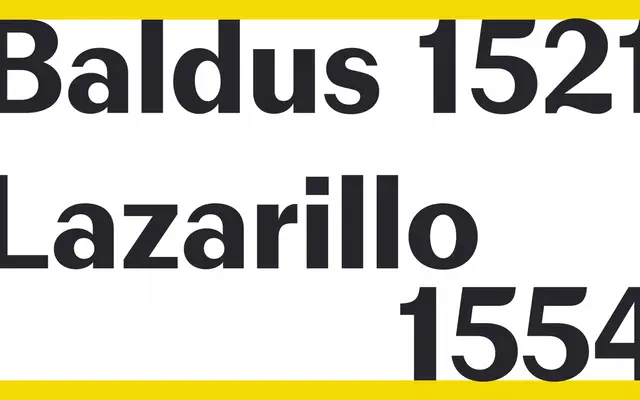
A high-contrast grotesque by Rui Abreu that strips the serifs from 19th-century Egyptian faces while preserving their marked thick-thin rhythm.
About
Designed by Rui Abreu and released in 2023, Picaresk takes the structural contrast of Victorian Egyptian typefaces and removes the serifs, leaving thin upstrokes, arms and crossbars set against heavy downstrokes. Six weights from Light to Black each come with matching italics, giving 12 styles in total alongside a variable font. The result sits between classical grotesque tradition and something more characterful, suited to editorial work where contrast carries visual weight.
Classification
Described explicitly as a grotesque, Picaresk draws from 19th-century Egyptian slab faces with serifs removed, retaining their pronounced thick-thin contrast in a sans-serif structure.