Plural
R-Typography · Rui Abreu · 2017
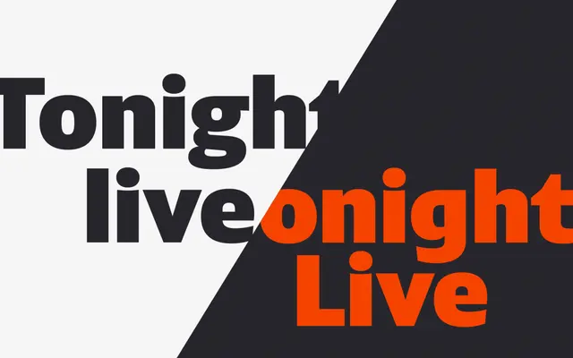
A twelve-style sans by Rui Abreu that balances formal editorial qualities with the clean, streamlined shapes suited to branding work.
About
Designed by Rui Abreu in 2017, Plural spans six weights from Thin to Black, each with a matching italic, covering branding and editorial applications. Its defining characteristic is a dual-form lowercase g, which toggles between a more traditional double-storey form and a simpler single-storey version, giving designers a handle on how formal or neutral the type feels. The Latin character set extends across a wide range of languages including African and Pacific scripts written in Latin orthographies.
Classification
Plural blends the sleek, streamlined shapes typical of branding-oriented sans-serifs with a slight formal and historical flavour more common to editorial faces, placing it within the humanist sans tradition.