Rizoma L
R-Typography · Rui Abreu · 2022
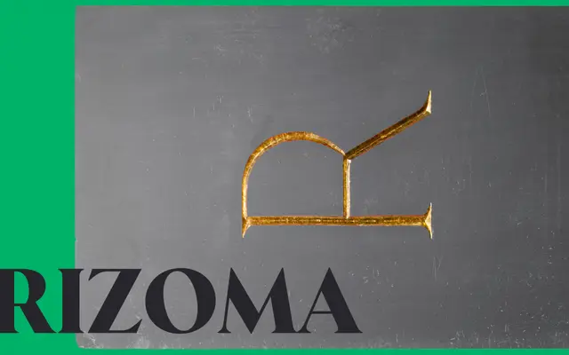
A contemporary revival of Roman inscription lettering by Rui Abreu, structured across three optical sizes with six weights and cursive italics.
About
Drawing on Edward M. Catich's research into the stroke patterns underlying imperial Roman lettering, Rizoma adopts a utilitarian and slightly constructivist approach rather than a purely archaeological one. Three optical sizes — S for body text, M from display sizes, L for large-scale titling — each comprise twelve styles spanning ExtraLight to Black with matching italics. Small caps were developed in collaboration with Risto Kujanpää, and the family supports an extensive range of Latin-script languages.
Classification
Rizoma draws directly from Roman monumental inscription letters, inspired by Catich's analysis of the origin of serifs. Its slightly constructivist, utilitarian character places it in a contemporary inscriptional serif subcategory.