Soft Grotesk L
R-Typography · Rui Abreu · 2026
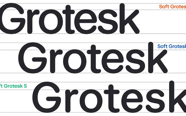
A rounded neo-grotesque by Rui Abreu that tempers Swiss-style clarity with humanistic proportions and softened terminals across three optical sizes.
About
Sharing its structural bones with R-Typography's Mild Grotesk, Soft Grotesk swaps the hard terminals for rounded ones, lending warmth without abandoning the assertiveness of Swiss-influenced design. Three static optical sizes — L, M and S — each adjust spacing and x-height to suit display or continuous reading, while a variable font ties those parameters dynamically to body size. Ten styles in the L cut run from ExtraLight to Bold with matching italics.
Classification
A rounded neo-grotesque with humanistic proportions, designed as a companion to Mild Grotesk but with softened terminals, placing it clearly in the grotesque tradition with humanist inflection.