Solfa
R-Typography · Catarina Vaz & Rui Abreu · 2023
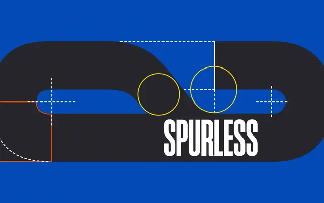
A flat-sided, spurless condensed display face originally drawn for the R-Typography wordmark, carrying a blunt brutalist character.
About
Designed by Catarina Vaz and Rui Abreu, Solfa was built for the R-Typography logo before being released as a three-style family comprising Regular, Italic and Verso. Its blocky proportions, flat sides and absence of spurs produce a sturdy, undecorated texture well suited to headlines and identity work at generous sizes. The minimal optical corrections give it a raw, unpolished quality that recalls vernacular type with a faint historical undertone.
Classification
Flat-sided, spurless and blocky with minimal optical corrections, Solfa is a condensed display face with a self-described brutalist character, placing it firmly outside text categories.