Staff Grotesk
R-Typography · Rui Abreu · 2021
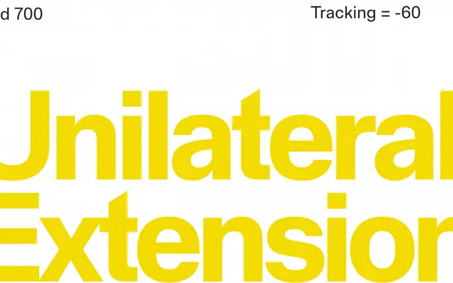
A text-oriented grotesque by Rui Abreu that strips back the expressive qualities of the original Staff family in favour of readability at smaller sizes.
About
Designed separately from the original Staff (2019), Staff Grotesk retains a handful of the parent family's idiosyncrasies, including a large-bowled lowercase 'a', pointed apex on the capital M and a vertically-cut tail on the Q, but frames them within a more conventional European grotesque structure. Wider spacing, open counters and a reduced range of four weights from Light to Bold orient it squarely towards continuous text rather than display use. Eight styles are available, each with a matching italic, along with a variable font.
Classification
A text-oriented grotesque sans with wide spacing and open counters, positioned within the European sans serif tradition and designed separately from the display-oriented Staff family.