Sul Sans
R-Typography · Rui Abreu · 2016
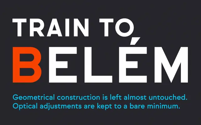
A geometrically constructed sans drawn from capital letterforms observed on Portuguese signage and façades, deliberately resisting classical optical corrections.
About
Designed by Rui Abreu and released in 2016, Sul Sans takes cues from the strict, idiosyncratic geometry found in lettering on Portuguese buildings and street signage. The family runs across five weights from Light to Black, each with a matching italic, totalling ten styles. Minimal optical adjustment is a deliberate choice, preserving the undesigned, vernacular quality that distinguishes the typeface from more polished geometric sans families.
Classification
Geometrically constructed with minimal optical corrections, drawing on vernacular letterforms observed on Portuguese signage and façades; sits within the geometric sans tradition but with a deliberately undesigned, idiosyncratic character.