Sul Tripla
R-Typography · Rui Abreu & Catarina Vaz · 2018
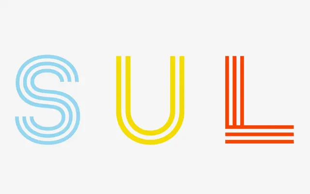
A triple-line constructivist spin-off of Sul Sans that makes the geometric construction of each letter visually explicit through parallel strokes.
About
Part of the Sul Effects group alongside Sul Dupla and Sul Stencil, this single-style display face strips Sul Sans back to its geometric skeleton and redraws each letter as three parallel lines. The effect foregrounds construction over legibility, making it suited to headlines, logotypes and graphic contexts where structure is the point. Designed by Rui Abreu and Catarina Vaz and released in 2018.
Classification
A triple-line constructivist variant of Sul Sans, exposing the geometric skeleton of each letterform through parallel strokes. Classified as display due to its decorative, structural nature unsuited to running text.