Tripsis L
R-Typography · Rui Abreu · 2025
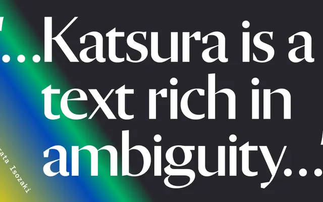
A serif-proportioned sans by Rui Abreu designed for titling, where old-style letterform rhythms are preserved but serifs are deliberately absent.
About
Designed by Rui Abreu and released in 2025, Tripsis L draws on old-style serif proportions while removing the serifs entirely, creating a letterform that sits somewhere between classical book type and contemporary sans. The tight letter spacing is built into its DNA, encouraging the tension between stems to drive visual energy in headline settings. Twelve styles run from ExtraLight to Black with matching italics across a wide range of Latin-extended language support.
Classification
Described as a hybrid between old-style serif and sans-serif, it retains the proportions and rhythm of traditional book typefaces while omitting serifs entirely, placing it in humanist sans territory with a strong calligraphic heritage.