Kin
Radim Pesko · Radim Pesko · 2020
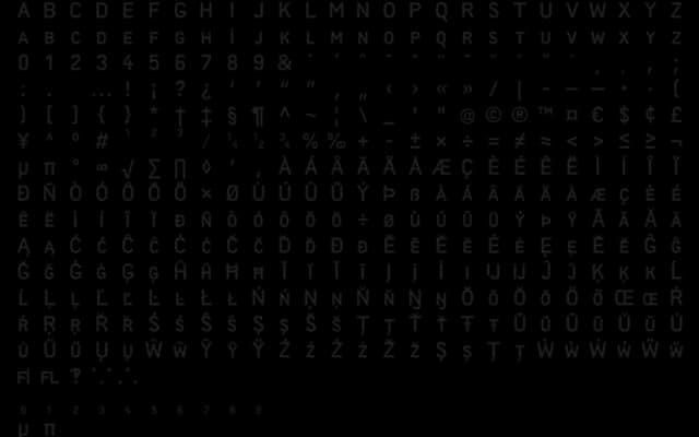
A single-weight, caps-only serif designed over nearly three years in London, distinguished by diacritics that are structurally welded into each letterform rather than added as accents.
About
Designed between April 2017 and January 2020, Kin takes an unusual approach to diacritical marks, treating them as integral components of letter construction rather than floating appendages. The family consists of capitals and small caps only, available in one weight, giving it a focused and uncompromising character. It has appeared in headlines for Le Monde, suggesting a practical application in high-quality editorial contexts.
Classification
A caps-and-small-caps serif with pronounced diacritics structurally integrated into the letterforms, placing it firmly in contemporary display serif territory with an idiosyncratic typographic voice.