Renotype
Radim Pesko · Radim Peško
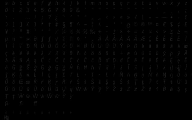
A five-style family by Radim Peško spanning traditional roman and italic through to mono, quasitalic and medieval, built around deliberately non-historical letterforms.
About
Designed by Radim Peško in collaboration with 205TF, the family deliberately sidesteps period or tool references in favour of what the designer calls aesthetic functionality. Its five styles — Regular, Italic, Mono, Quasitalic and Medieval — are framed as distinct narrative registers rather than mere weight or width variants. The family appears in headlines for Le Monde, signalling its credibility at editorial scale.
Classification
Renotype is described as aesthetically functional with letterforms avoiding historical or tool-based reference, spanning styles from traditional roman and italic to mono, quasitalic and medieval, suggesting a humanist sans at its core with experimental extensions.