Barbour
Regular Bold Italic · Timo Kuilder
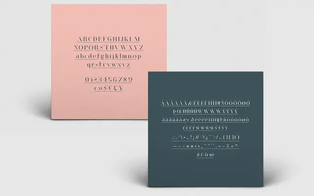
A single-weight stencil serif by Timo Kuilder, built around strong thick-thin contrast for editorial headlines and poster work.
About
Designed by Timo Kuilder, Barbour is a stencil serif with pronounced thick-thin contrast aimed at display-scale use. Its 213-glyph set covers uppercase, lowercase, diacritical marks, ligatures, currency and symbols, making it serviceable across most Western Latin editorial contexts. Best suited to magazine covers, posters and headings where the stencil interruptions and high contrast read as deliberate style rather than limitation.
Classification
A high-contrast stencil serif intended for large display use such as magazine headers and posters; the stencil cuts and dramatic thick-thin contrast place it firmly in display rather than body text territory.