Guyot Headline, Text & Press
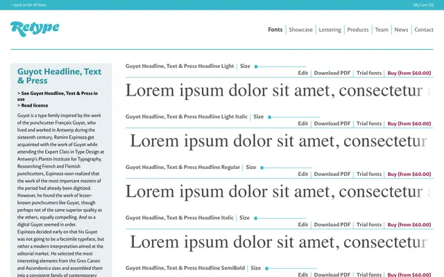
A three-subfamily revival drawing on 16th-century French punch-cutting traditions, with distinct optical variants for headline, text and simulated letterpress use.
About
The family divides into three purpose-built subfamilies: Headline runs from Light to Black with italics for display work, Text covers the middle weights for continuous reading, and Press introduces graded variants that mimic the ink spread of letterpress printing. The Press subfamily offers three grades per weight and style, giving designers fine control over apparent heaviness without changing weight. Together the three subfamilies amount to a substantial type system rooted in Renaissance French type history.
Classification
The three-subfamily structure of Headline, Text and Press, combined with the historical name Guyot referencing the 16th-century French punchcutter Jacques de Guyot, points to a revival of Renaissance or Garamond-era letterforms with optical size differentiation.