sans-serifgrotesque
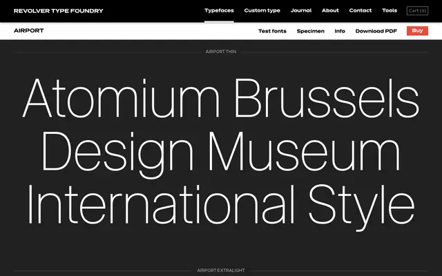
A seven-weight grotesque sans drawn from the Swiss International Typographic Style tradition, named with a nod to mid-century institutional signage.
About
Seven weights from Thin to Bold give Airport a practical range for editorial and identity work. The typeface draws its aesthetic from 1950s Swiss and German design movements, referencing the clean, systematic approach of the International Typographic Style. No italics or condensed cuts are offered, keeping the family focused and minimal.
Classification
The specimen copy references Swiss Design and the International Typographic Style directly, and the typeface's name and aesthetic align with the mid-century European grotesque tradition.
Weights
ThinExtraLightLightRegularMediumSemiBoldBold
Languages
Latin
Tags
grotesqueswissinternational-stylemid-centuryneutralgeometric