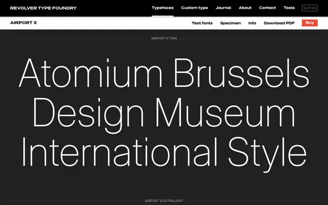
A seven-weight grotesque drawn from the tradition of Swiss International Style and mid-century European wayfinding typography.
About
Airport X runs from Thin to Bold across seven weights, its specimen texts referencing the Swiss and German design movements of the 1950s and figures such as Arne Jacobsen and Ingo Maurer. The design sits in the clean, systematic register of standard grotesques associated with airport and public signage from that era. It suits editorial work and identity projects that call for neutral, rationalist letterforms without ornamentation.
Classification
The naming, specimen imagery and references to Swiss Design and International Typographic Style firmly place Airport X in the grotesque tradition, with a neutral, systematic character typical of mid-century European airport and wayfinding signage.