seriftext serifitalic
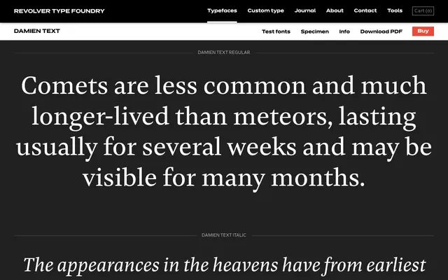
A text serif from Revolver Type Foundry offered in four weights, each with a matching italic, suited to editorial and long-form print work.
About
Four weights from Regular to Bold, each paired with an italic, give Damien Text a practical range for editorial and book typography. The naming convention and weight range suggest a design built around sustained legibility rather than display impact. Little contextual information is provided by the foundry, but the specimen copy, drawn from astronomical writing, sets a clear bookish register.
Classification
Damien Text presents as a text-optimised serif with regular, medium, semibold and bold weights alongside matching italics, suggesting a design tuned for sustained reading rather than display use.
Weights
RegularMediumSemiboldBold
Languages
Latin
Tags
textserifbookeditorialreadableprint