Le Rosart Display
serifbaroque serifitalic
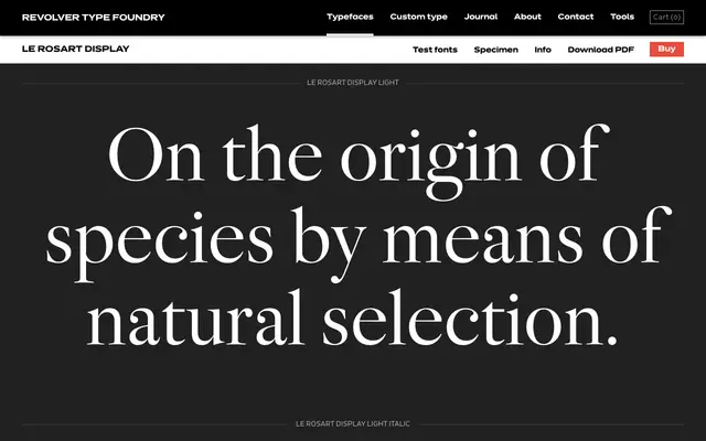
A five-weight display serif drawing on French Baroque letterform traditions, available with matching italics throughout.
About
Le Rosart Display is a high-contrast serif family with five weights from Light to Bold, each paired with an italic. The specimen copy references French Baroque architecture and 17th-century couture, placing the typeface firmly in a historical register suited to editorial headlines, luxury branding and cultural publishing. The Display designation signals that the optical sizing is tuned for large-scale use.
Classification
The naming and specimen copy reference French Baroque and 17th-century heritage, suggesting a high-contrast serif in the tradition of French Baroque letterforms, positioned specifically as a display cut.
Weights
LightRegularMediumSemiboldBold
Optical sizes and widths
Display
Languages
Latin
Tags
baroquedisplayserifhigh-contrastfrenchhistoricaleditorial