No. 43
Road to Venice Type · 2023
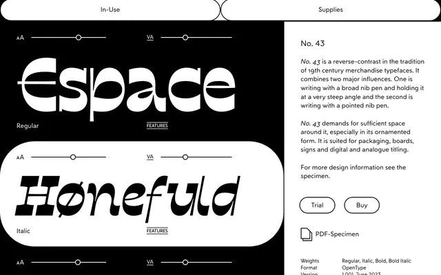
A reverse-contrast display typeface drawing on 19th century merchandise letterforms, shaped by both broad-nib and pointed-nib pen traditions.
About
No. 43 takes its cues from 19th century merchandise typography, combining the influence of a steep-angled broad-nib pen with the character of a pointed nib. The result is a reverse-contrast display face suited to packaging, signage and titling work, where it benefits from generous surrounding space, particularly in its ornamented form. Available in four styles across Regular, Italic, Bold and Bold Italic.
Classification
No. 43 is explicitly described as a reverse-contrast typeface in the tradition of 19th century merchandise typefaces, combining broad-nib and pointed-nib pen influences. Reverse-contrast display is the most accurate subcategory.