Plateau Five
Road to Venice Type · 2022
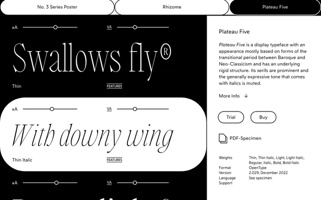
A display serif drawing on transitional-era Baroque and Neo-Classical letterforms, built around a principle of optically equalised character widths.
About
Plateau Five combines the prominent serifs and structural rigidity of the transitional period between Baroque and Neo-Classicism with an unusual design principle: most Latin character widths are optically equal, an idea the foundry roots in the social philosophies of 1920s modernity. Italics are present across all four weights but their expressive quality is deliberately restrained relative to convention. The family covers Latin Extended character sets with standard ligatures and a broad set of accented characters.
Classification
The foundry describes Plateau Five as a display typeface rooted in transitional period forms between Baroque and Neo-Classicism, with prominent serifs and a rigid underlying structure, placing it firmly in the display serif category with transitional characteristics.