Rhizome
Road to Venice Type · 2017
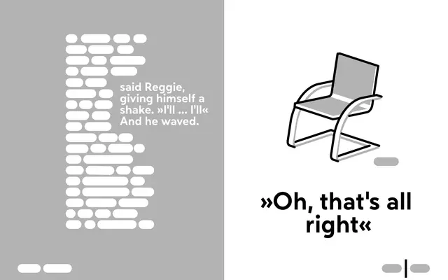
A geometric sans with classical proportions and wedge-shaped details, designed for both text setting and display use.
About
Released in 2017, Rhizome draws on early 20th-century typographic ideals, pairing geometric construction with letterform proportions borrowed from serif traditions. The family runs across six weights from UltraLight to Heavy, each with a matching oblique, giving it range across editorial and identity contexts. Wedge-shaped details add a quiet distinctiveness without departing from functional legibility.
Classification
Rhizome is built on a geometric construction juxtaposed with classical proportions and wedge-shaped details, placing it firmly in the geometric sans tradition while drawing on early 20th-century typographic ideals.