Neacademia
Rosetta · Sergei Egorov · 2011
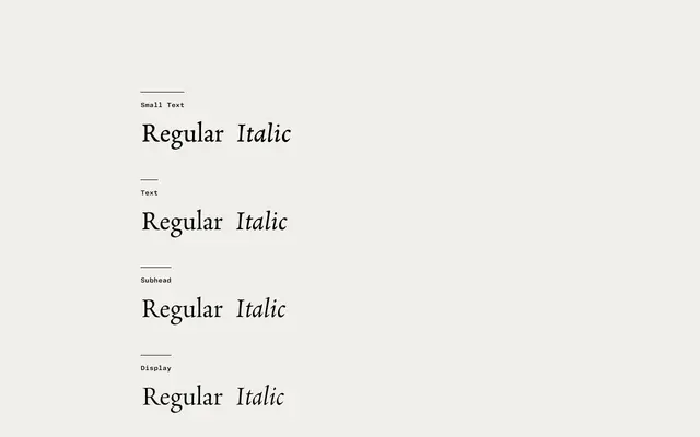
A historically sensitive revival of Francesco Griffo's 15th-century Aldine types, optimised across four optical sizes for both Latin and Cyrillic setting.
About
Designed by Sergei Egorov and released in 2011, Neacademia draws directly from the punchcutting techniques of Francesco Griffo, whose types defined Venetian printing for Aldus Manutius. The family runs across four optical variants — Small Text, Text, Subhead and Display — each tuned for its intended size range, with display cuts retaining calligraphic warmth and text cuts following the carver's hand more closely. It also incorporates Griffo's italic capitals, harmonised with the lowercase, and was designed with letterpress photopolymer printing in mind, tolerating low resolution and rough paper with ease.
Classification
A revival of the Aldine types cut by Francesco Griffo in the 15th century, Neacademia falls squarely into the old-style or humanist serif tradition, with calligraphic roots and optical size variants following metal type conventions.