Albula Narrow Pro
Serpentype · Silvio Meier
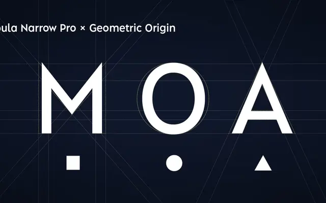
A narrow geometric sans by Silvio Meier designed for compact typesetting across tables, data layouts and tight editorial columns.
About
The narrow companion to Albula Pro, this family preserves the parent's geometric construction and sharp terminals while reducing width for space-constrained applications. Nine weights from Thin to Extra Bold are paired with matching obliques, and four stylistic sets offer alternate forms for characters such as A, N and the lowercase a. Suited to branding, packaging, signage and spreadsheet contexts where compactness and legibility must coexist.
Classification
Described explicitly as a contemporary geometric sans, derived from basic geometric forms with sharp terminals and a narrow proportion optimised for compact typesetting.