Albula Pro
Serpentype · Silvio Meier
sans-serifgeometric sansitalic
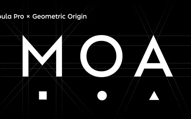
A geometric sans by Silvio Meier spanning nine weights with obliques, designed for legibility across editorial, branding and interface work.
About
Designed by Silvio Meier, Albula Pro draws on Swiss geometric traditions while incorporating optically corrected letterforms to maintain open counters and even spacing at small sizes. Nine weights run from Thin to Extra Bold, each paired with an oblique, giving eighteen styles in total. Stylistic sets offer alternate forms for letters including A, N, M, V, W and Z, a double-storey lowercase a, and a simplified lowercase l.
Classification
Described explicitly as a contemporary geometric sans, combining geometric clarity with humanist warmth and optically corrected letterforms.
Weights
ThinExtra LightLightSemi LightRegularMediumSemi BoldBoldExtra Bold
Languages
Latin
Tags
geometrichumanistswisseditorialcorporateobliquelegiblemulti-weight