Remi
Setup Type · Ondrej Jób · 2012
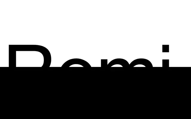
A geometric monospaced sans-serif by Ondrej Jób, its proportions and construction drawn from classic segmented LCD displays across ten styles from Light to Black.
About
Remi has no stroke contrast, a natural width and a notably small x-height, with capitals sharing the same height as the ascender and the x-height sitting at exactly half the cap height. A secondary set of shorter capitals is included, accessible as small capitals or via Stylistic Set 1. The 720-glyph character set covers over 100 languages and includes tabular lining and oldstyle figures, fractions, small capitals, contextual alternates and more than 40 special ligatures for metric and imperial measurement units.
Classification
Explicitly described as a monospaced sans-serif with no stroke contrast; proportions derived from classic segmented LCD displays, placing it firmly in the geometric monospace category.