Clauthbound
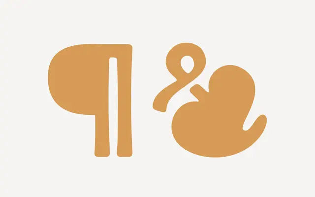
A three-weight display sans drawn from the foil-stamped cloth book covers of the early-to-mid 20th century, with gently rounded corners and a built-in icon set of over 40 marks.
About
Inspired by gold foil pressed into cloth-bound books from the early 20th century, the typeface carries a soft, slightly worn quality through its gently stressed strokes and rounded corners. It ships in Regular, Semibold and Bold, covering uppercase letters, numerals, diacritics and a set of alternate characters alongside discretionary ligatures. Over 40 period-appropriate icons are included, designed to sit naturally alongside the letterforms for use on posters, invitations and themed editorial work.
Classification
A gently-stressed, uppercase-only display sans with rounded corners and vintage book-cover character; the decorative intent and restricted case make it firmly display rather than a general-purpose sans.