Grandsans
Simple Bits · Dan Cederholm
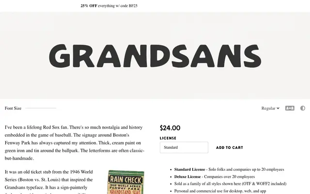
An all-caps display family drawn from 1940s baseball stadium signage, with a clean Regular and a distressed Rough variant evoking thick painted letterforms.
About
Inspired by a 1946 World Series ticket stub and the hand-lettered signage around Boston's Fenway Park, Grandsans captures the idiosyncratic quality of mid-century sign painting. The family ships in two styles, Regular and Rough, both all-caps, with a set of alternate characters and discretionary ligatures for fractional figures. Quirky letterforms in E, M and N, plus a backwards K for strikeout scorekeeping, give it a specific, period-faithful character.
Classification
An all-caps display typeface drawn from early-to-mid twentieth century sign-painting traditions, specifically inspired by hand-lettered baseball stadium signage; its quirky letterforms and Rough variant place it firmly in the display category.