Hauser
SM · Mark Niemeijer · 2017
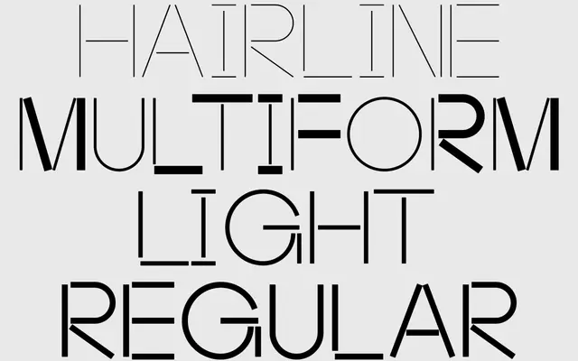
A modular display typeface built from circles, squares and lines on a fixed grid, drawing on Structuralist and Metabolist architecture and Suprematist composition.
About
Designed by Mark Niemeijer and released in December 2017, Hauser constructs each character from repeating geometric primitives on a strict grid system, producing individually abstract glyphs that gain legibility through context. The family spans four fonts and takes its conceptual lead from the avant-garde architectural collective Team 10 and Suprematist visual principles. It sits alongside Maxeville Construct as part of SM's ongoing exploration of constructed, grid-driven typography.
Classification
Hauser is built entirely from basic geometric shapes on a fixed grid system, with characters formed from circles, squares and lines. Its highly abstract, constructed nature places it firmly in the display category as a modular geometric typeface.