Maxeville
SM · Mark Niemeijer · 2017
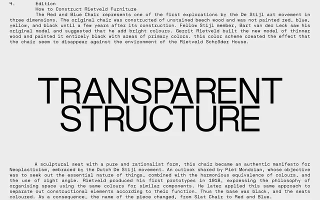
A neo-grotesque with geometric, constructed letterforms drawn from the visual vocabulary of De Stijl and Union des Artistes Modernes.
About
Designed by Mark Niemeijer and first released in 2017, the family draws on the work of Gerrit Rietveld and Jean Prouvé, giving its characters the appearance of assembled forms rather than conventionally drawn ones. The 14-font family spans Regular, Tekst and Construct subfamilies, each with italic counterparts and a Bold weight. Its version 2.0, released in January 2021, extended Latin coverage across a broad range of European languages.
Classification
Described by the foundry as a neo-grotesk with geometric properties; characters are designed to appear constructed rather than cut, drawing on the visual language of early 20th-century European modernist movements such as De Stijl and Union des Artistes Modernes.