Rietveld
SM · Mark Niemeijer · 2024
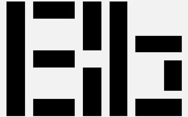
A constructed geometric typeface by Mark Niemeijer that restricts letterforms to vertical, horizontal and diagonal strokes, drawing on the typographic experiments of Bart van der Leck and De Stijl.
About
Released in December 2024, Rietveld takes proportional cues from SM's earlier Maxeville and pushes further into abstraction by building every character from only three stroke directions. The result is a Dutch-influenced family of four fonts spanning Regular and Bold weights across a proportional and a monospaced cut. The aesthetic sits closer to Bart van der Leck's 1930s typographic compositions than to conventional geometric sans design, making it most useful for editorial and identity work where a strong constructivist register is wanted.
Classification
Rietveld is built exclusively from vertical, horizontal and diagonal strokes in the tradition of De Stijl constructivism, making it a display-oriented geometric typeface closer to constructed lettering than a standard geometric sans.