Solaris
SM · Mark Niemeijer · 2019
sans-serifneo-grotesqueitalic
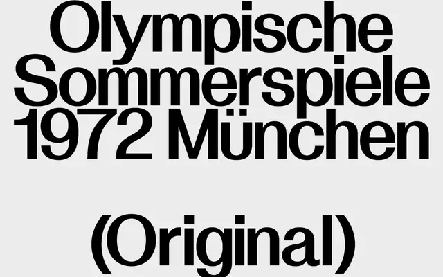
A high-contrast neo-grotesque by Mark Niemeijer that centres stroke emphasis to maintain rhythmic consistency across settings.
About
Designed by Mark Niemeijer and released in 2019, Solaris sits in the neo-grotesque tradition but introduces pronounced contrast with emphasis fixed at the centre of each stroke. This gives headlines a sleek, refined character while preserving readability at smaller sizes. The family comprises six fonts across three weights, each with a matching italic.
Classification
Explicitly classified as Neo-Grotesque by the foundry, with high contrast centred on the stroke axis, a defining trait of the neo-grotesque revival tradition.
Weights
LightRegularBold
Languages
Latin Extended
Tags
neo-grotesquehigh-contrasteditorialneutralsophisticatedlegible