Stellage
SM · Mark Niemeijer · 2020
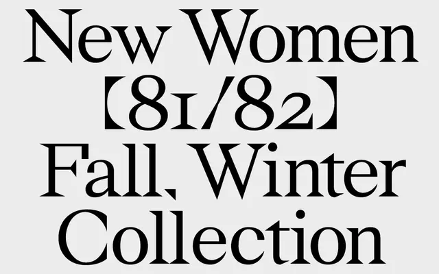
A five-style geometric serif with square and triangular serifs, drawing on the visual language of postmodern architecture.
About
Designed by Mark Niemeijer and released in 2020, Stellage treats each letterform as a miniature architectural structure, combining modern geometric construction with classical serif conventions. Square and triangular serifs give the family a sharp, distinctive texture that reads well at small sizes while offering compositional interest at display scale. The family spans five styles including constructed and italic cuts.
Classification
Explicitly classified as a geometric serif by the foundry, characterised by square and triangular serifs that give each letterform an architectural, constructed quality distinct from traditional humanist or transitional serifs.