Bureau Serif
Smuss Type Kiosk · William Stormdal · 2025
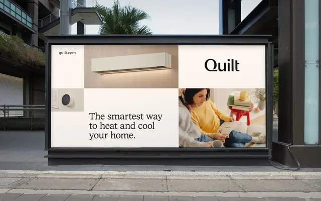
A constructed serif sharing its skeleton with Bureau Sans, offering six weights with italics across Standard, SemiMono and Mono cuts plus a variable file.
About
Designed by William Stormdal and launched in 2025, Bureau Serif inherits its structural logic from Bureau Sans: vertical contrast stroke, squared tittles and dots, and constructed serif bases give it a rationalist quality rarely found in text serifs. The family ships in three cuts — Standard, SemiMono and Mono — with six weights and matching italics throughout, plus a variable file covering the full range. Pair it with Bureau Sans and the shared skeleton makes mixed-typography layouts feel coherent rather than compromised.
Classification
A serif with vertical contrast stroke and constructed bases that shares a skeleton with Bureau Sans, placing it closer to rational or constructed serifs than traditional humanist or transitional models.