Earl
Smuss Type Kiosk · William Stormdal · 2024
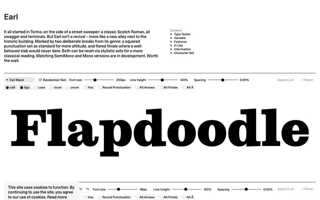
A Scotch Roman with flared finials and squared punctuation as its defaults, designed by William Stormdal and inspired by lettering spotted on a Torino street sweeper.
About
Rather than a straight revival, Earl reinterprets the Scotch Roman tradition through two deliberate rule-breaks: squared punctuation for visual attitude and flared finials where the genre would conventionally demand restrained bracketing. Both deviations can be switched off via stylistic sets for a more classical result. Seven weights from Thin to Black are available now as a variable font, with SemiMono and Mono cuts in development.
Classification
The foundry classifies Earl explicitly as Scotch Roman, with its high contrast, bracketed serifs and strong terminals placing it squarely in that tradition, though the addition of flared finials and squared punctuation as defaults marks deliberate departures from genre orthodoxy.